ELECTROPOLIS
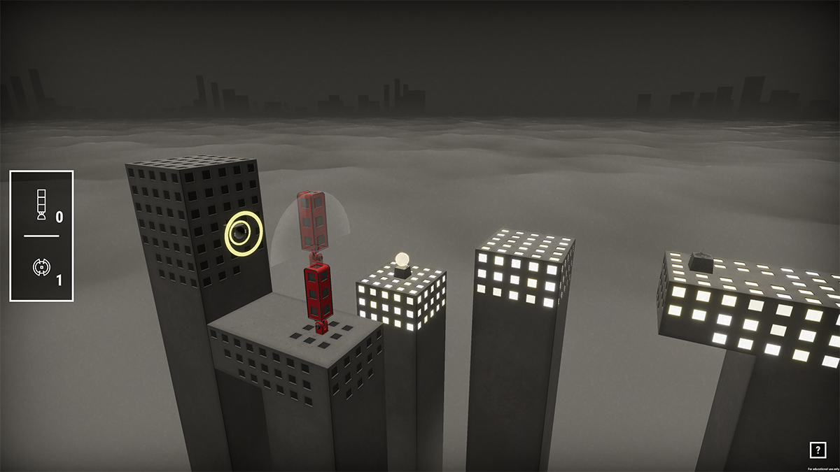
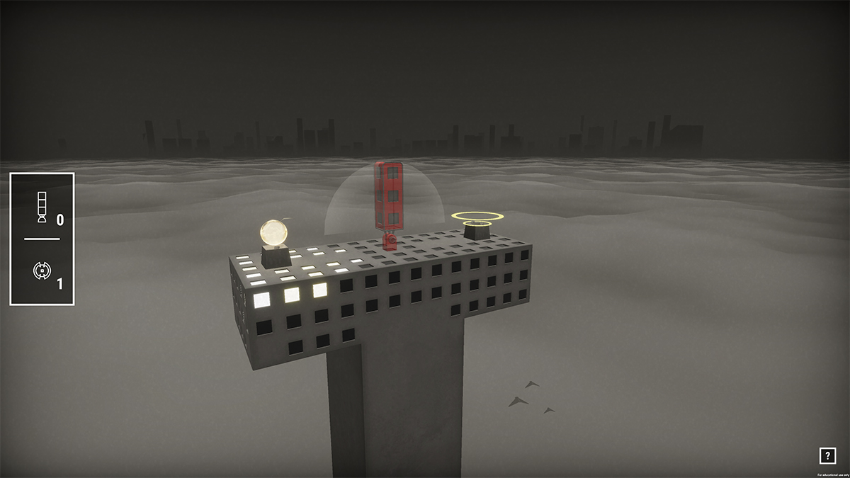
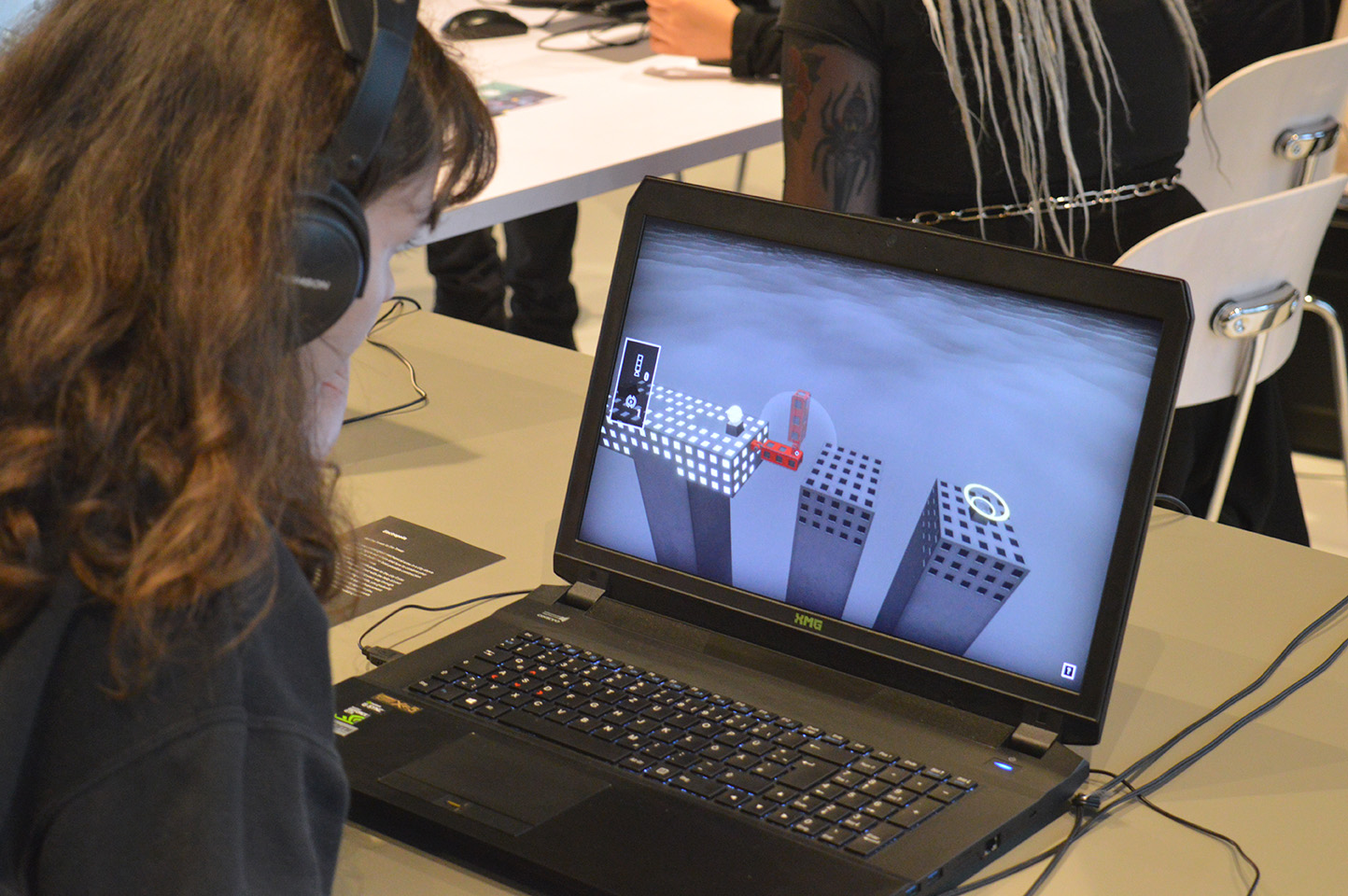
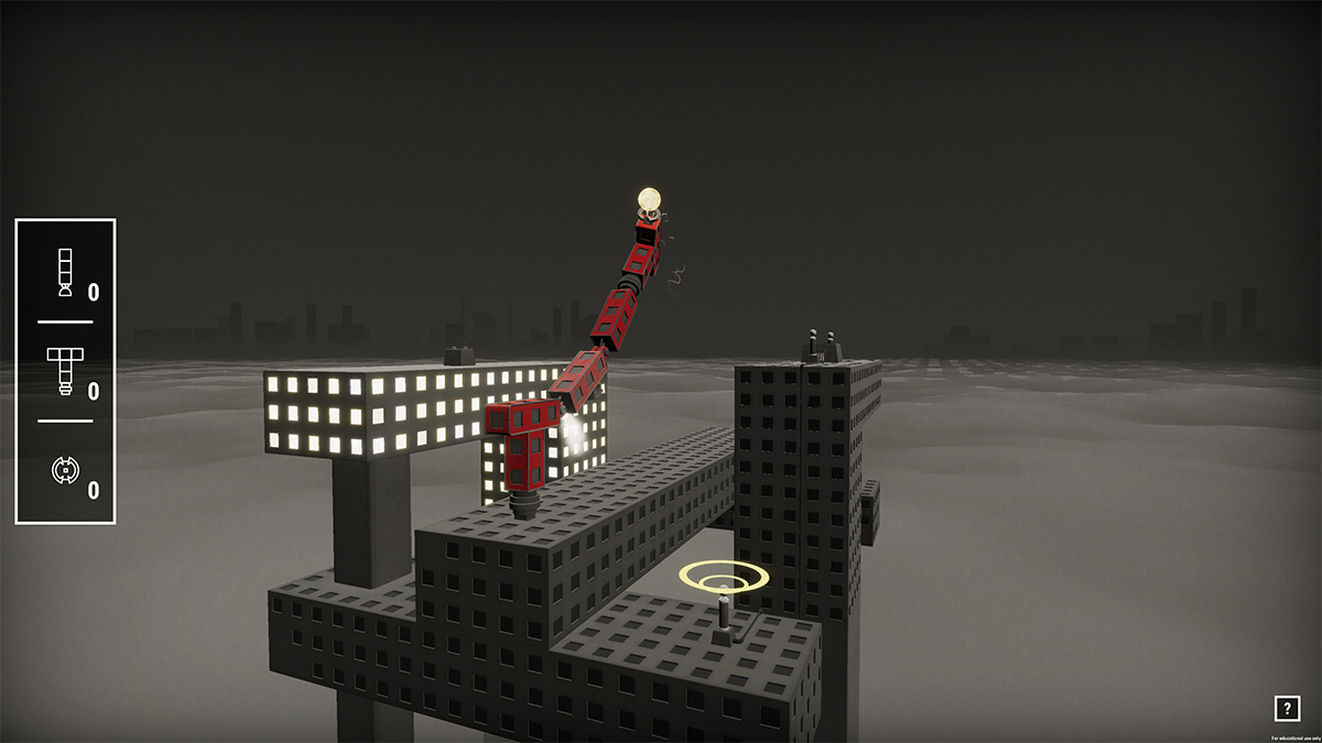
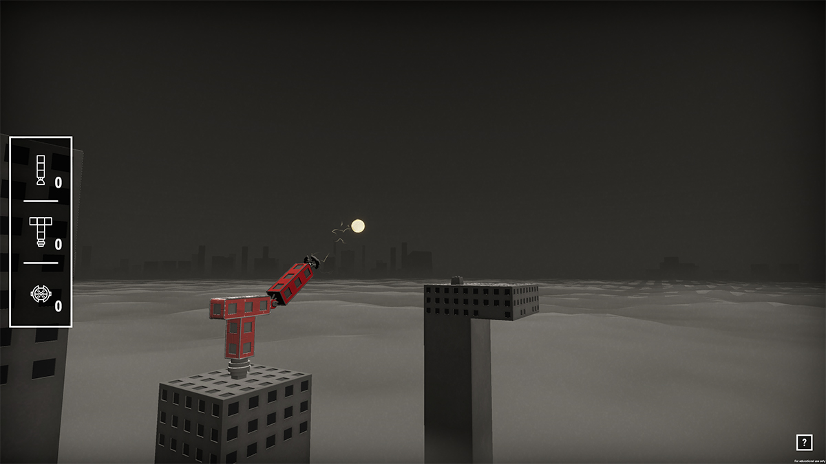
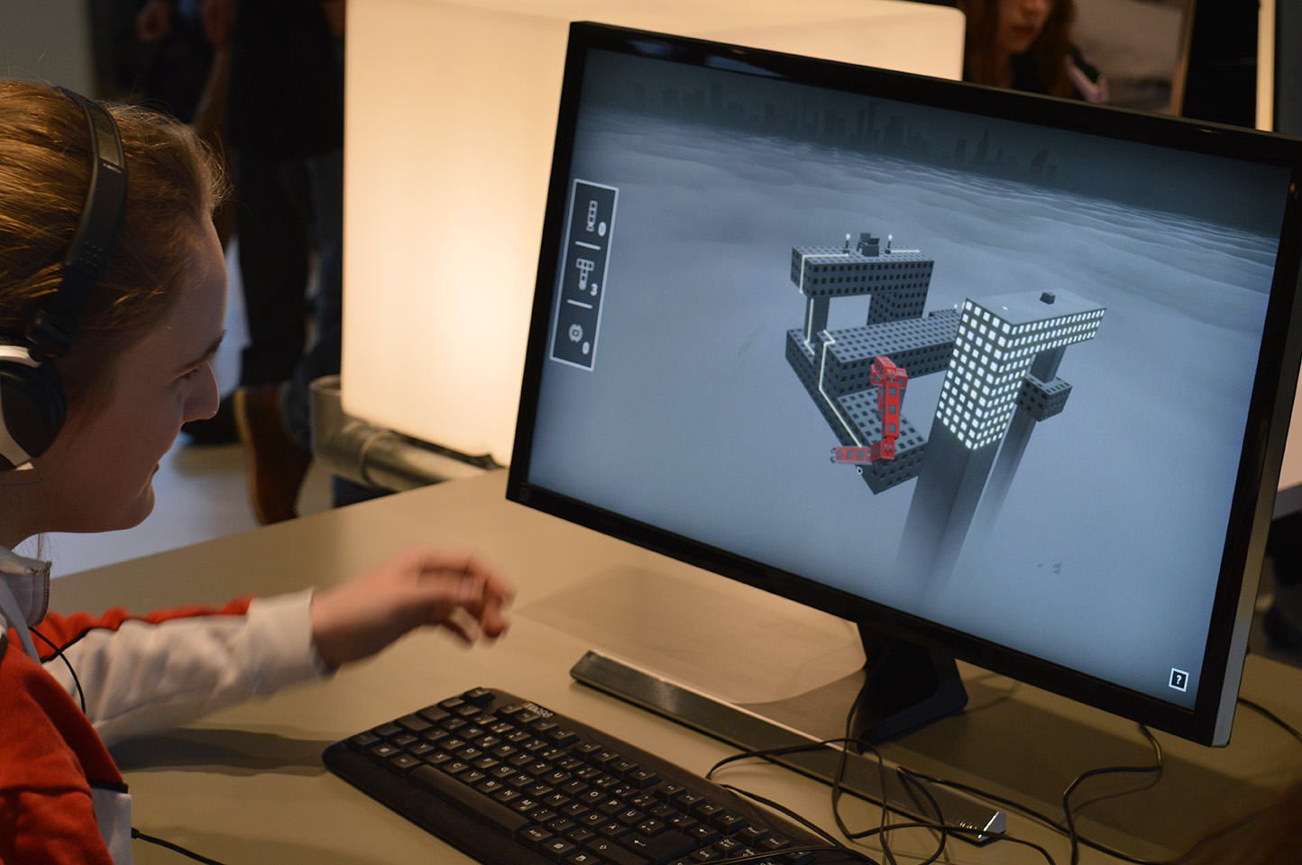
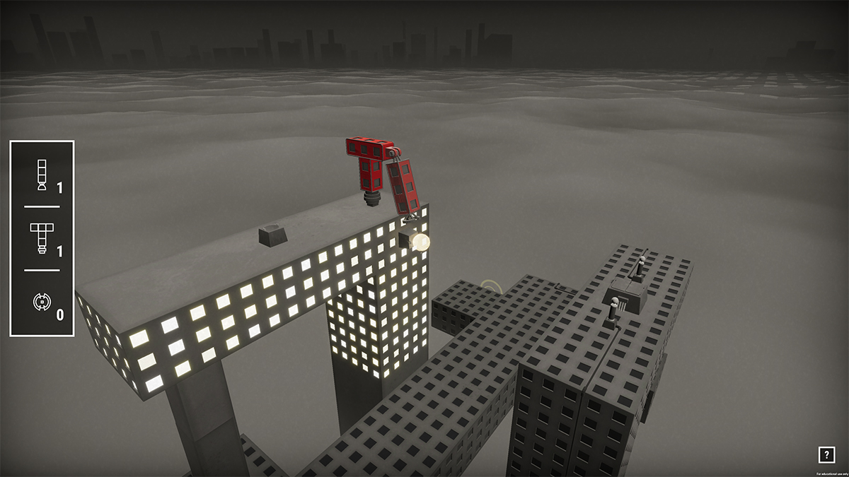
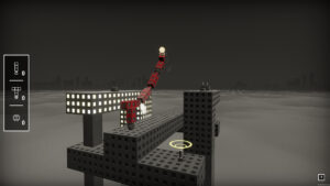
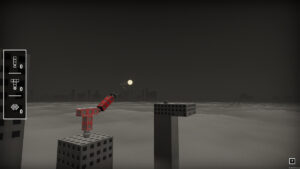
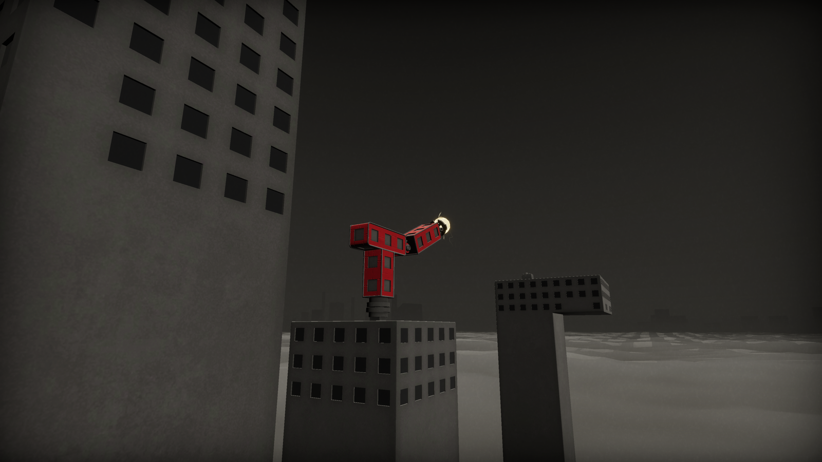
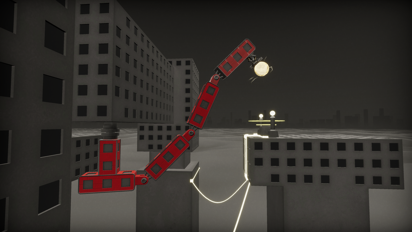
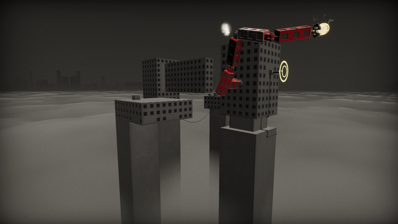
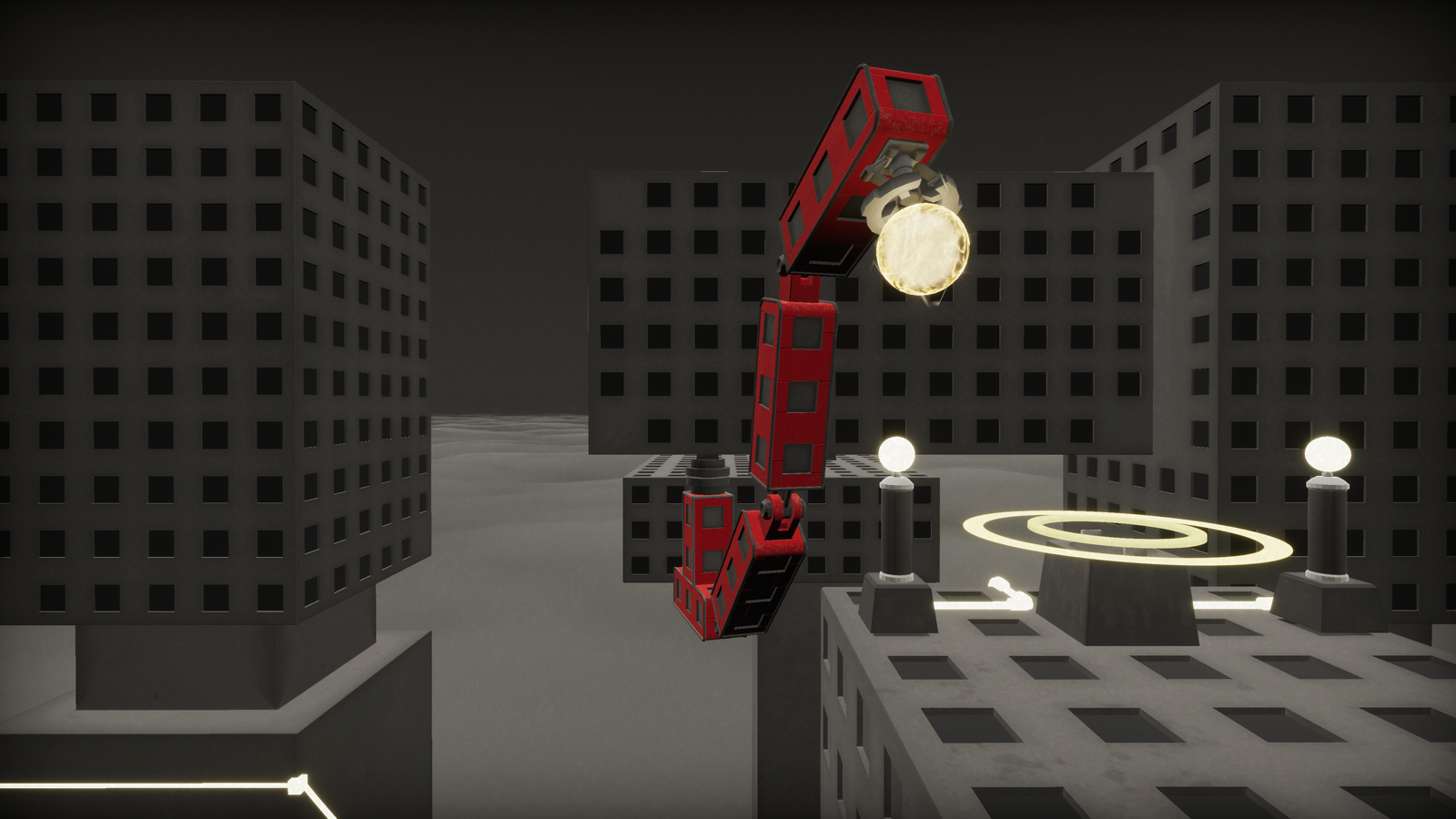
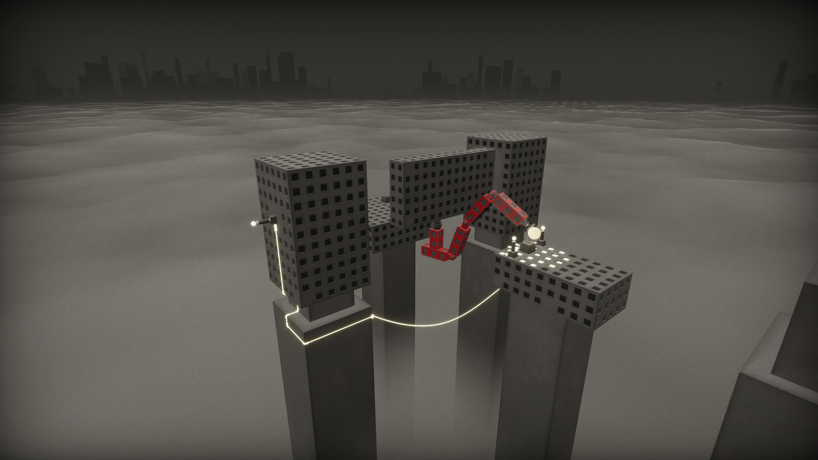
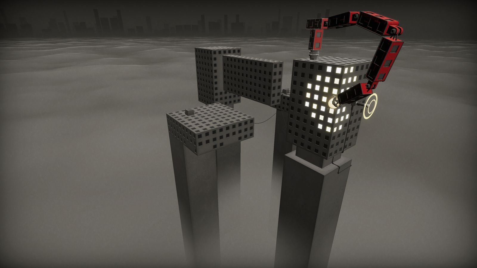
Electropolis is a building blocks puzzle game. Players build giant mechanical, controllable arms on top of a colossal city. With these constructions, they are able to transport an energy ball which is capable of activating all kinds of electric spots. Players can engineer their own solutions in order to get the ball to places that are challenging to reach.
PROJECT INFO
Date
3rd Semester, 2019–20
Duration
3 1/2 months
Team
Hagen Frick, Delia Rekowski, Felix Szczesny, Christoph Weinreich
Tech
Unity, C#, Unity Shader Graph, Maya, Substance Painter, Photoshop
My Part: I was mostly responsible for coming up with visuals for this game. I modeled the moving parts and the environment, as well as creating shaders to support the look and feel. In the early phase I also supported with programming in order to produce many prototypes quickly.
My main learnings: With this game we gave ourselves a lot of time for ideation and testing out all kinds of ideas. Given our limited amount of time, we should have stopped and focused on one idea earlier so we could have had a minimum viable product quickly. That way we would have had more time to iterate on the final game, which would have yielded even more interesting results.
DEVELOPMENT
Starting analogue
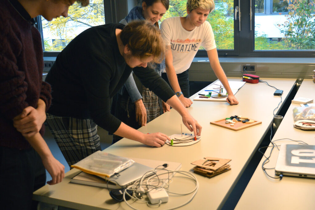
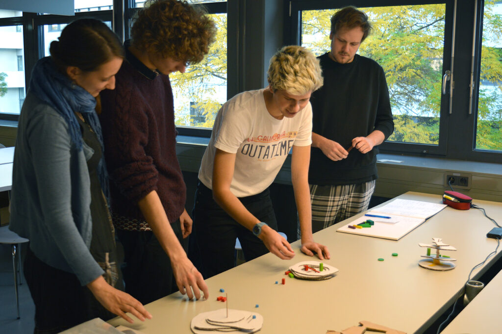
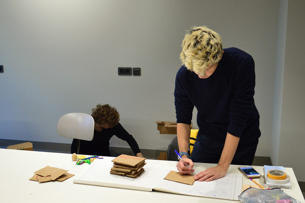
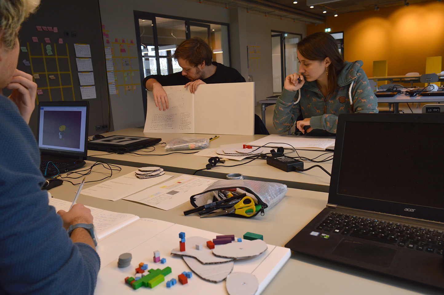
We decided to start our ideation process by gathering visual references from a variety of different sources. Analogue prototyping was a crucial step in our ideation process. This made it possible to quickly test and evaluate ideas and mechanics. This process was more efficient than starting digitally.
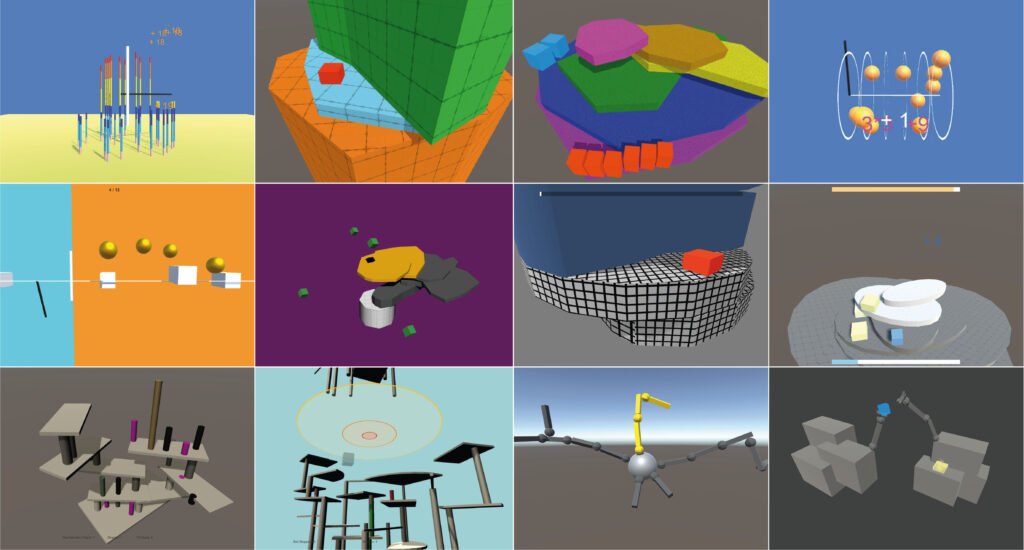
Quick Prototypes
During the analogue prototyping phase, everyone in our team came up with small ideas that were regularly pitched and shown to the others for evaluation.
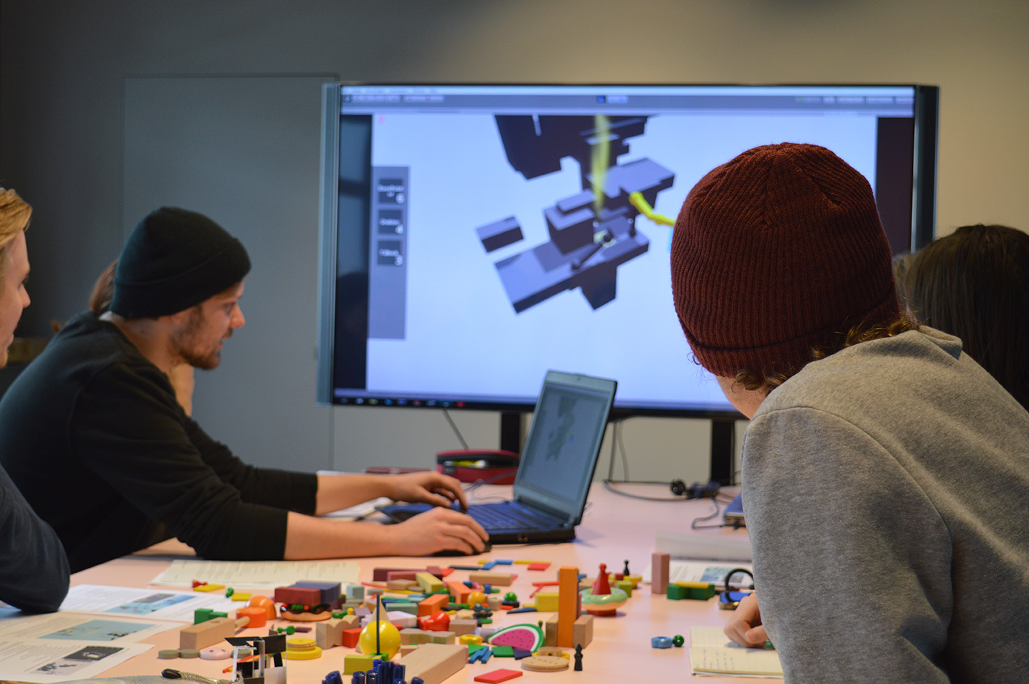
In order to explore these mechanics, we made a couple of simple digital prototypes which started our iteration process
Regular Meetings
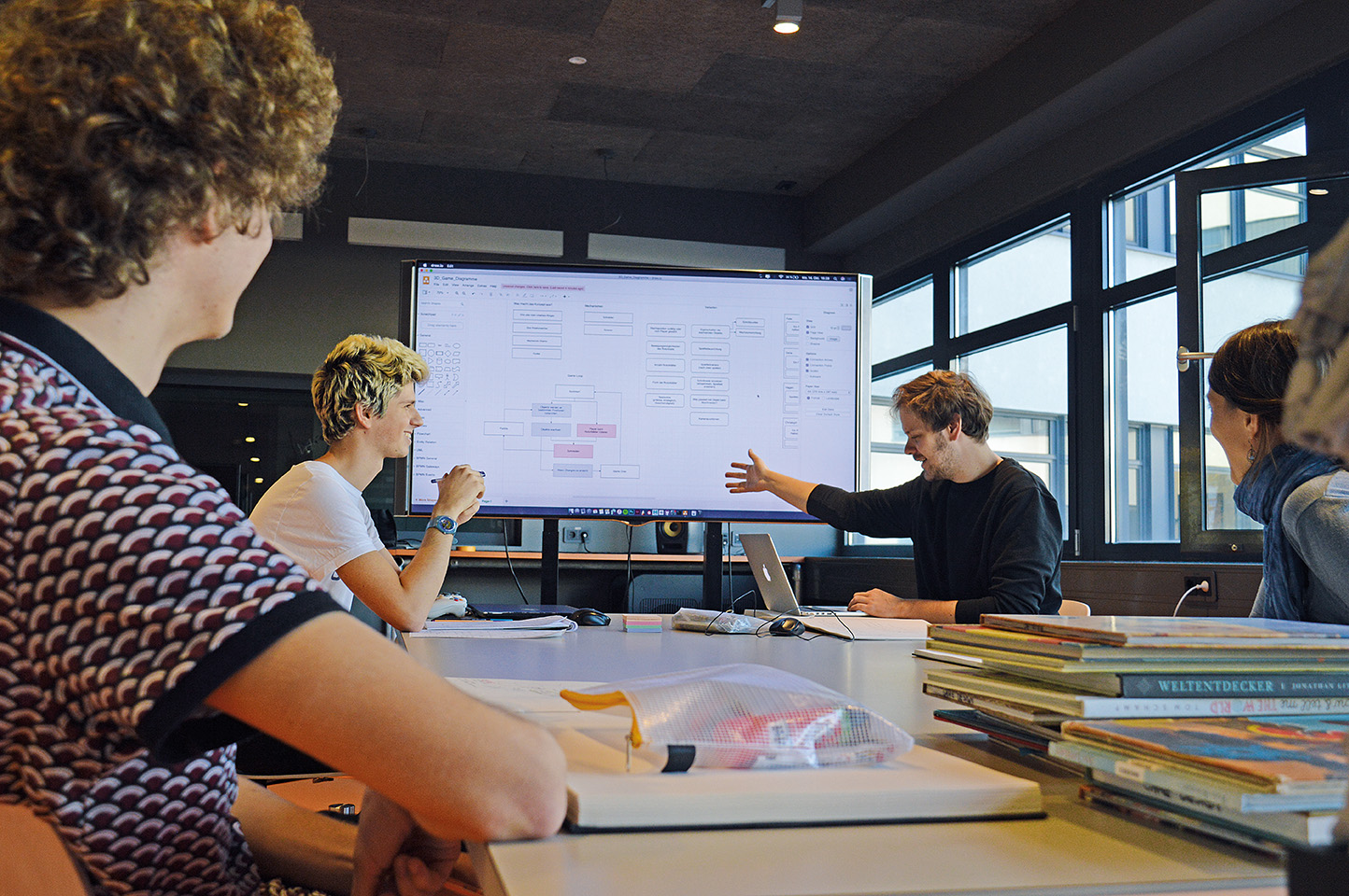
We held meetings in short intervals during the ideation process and then twice a week for prototyping. So each one of us knew what the other ones were working on at all times.
Tracking our work
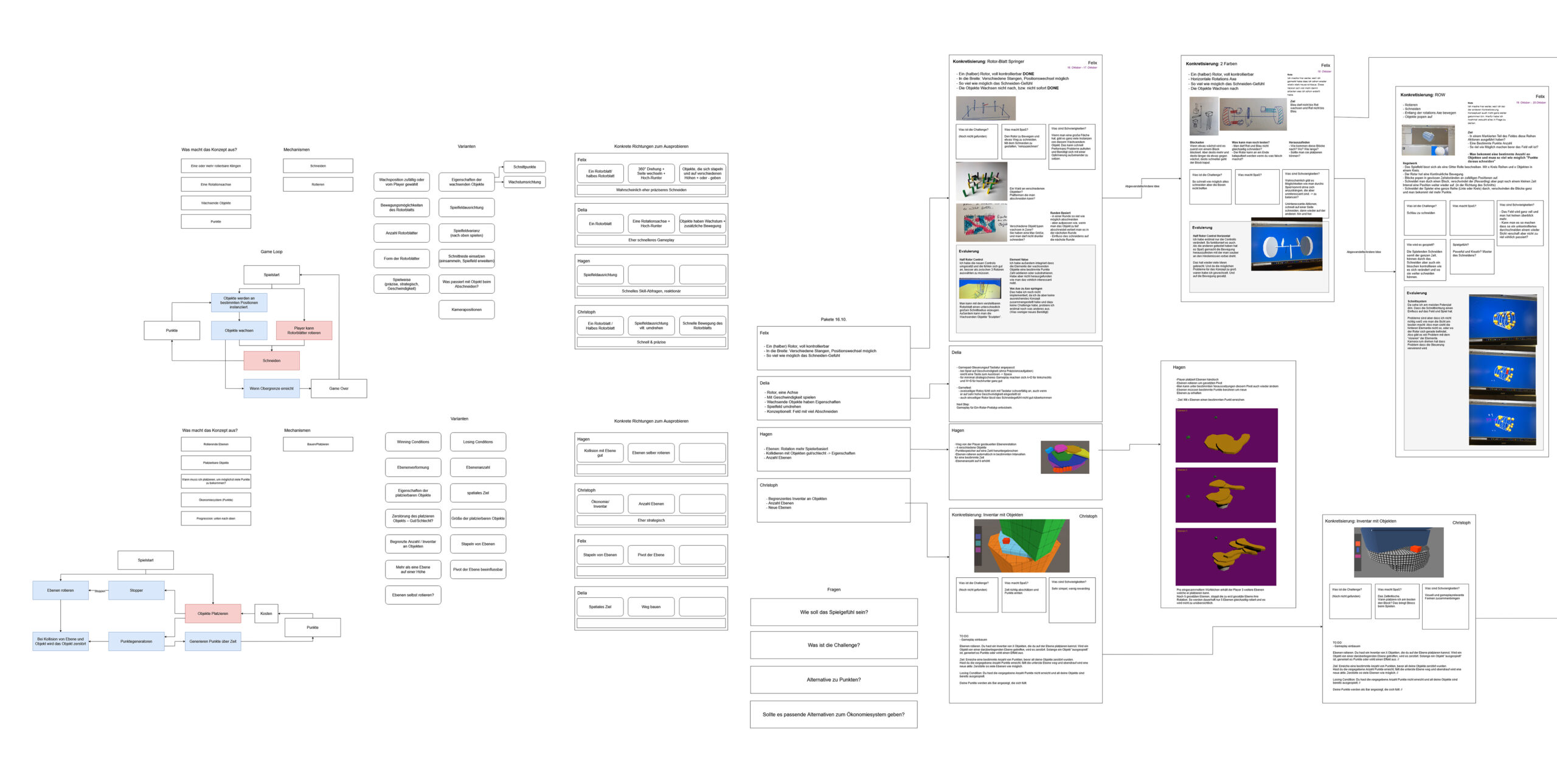
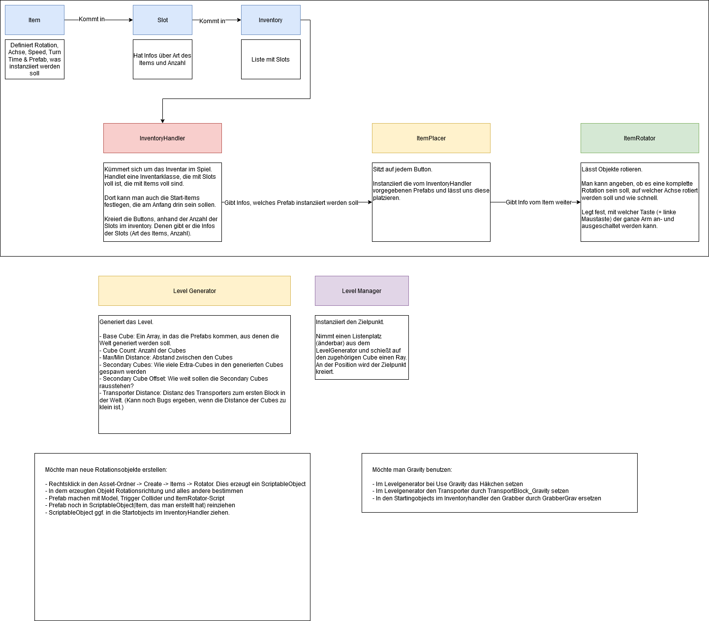
During meetings we used a digital pinboard to write down what we created, to organize our ideas and to keep track of decisions.
It helped us to clarify our vision for the game and to have documents to refer to in development.
Kanban
We additionally used physical Kanban-boards to keep track of short term tasks which could be viewed by everyone.
More learnings
How much structure?
We did a lot of regular planning and systematic documentation from the start. While this helped us immensely during development, sometimes it turned out to be too meticulous. We now think it would make sense to be more open for wild ideas and ways to work in the ideation phase.
Split work
We started working on everything together. It is great to involve everyone in preproduction but we did it for too long. This meant, we had less time to invest into individual areas that played into our strenghts.
Concretization
We wanted to take time to explore as many mechanics as possible. It was interesting to try out but we learned that it is dangerous to take as much time to reach defining decisions. We had a period where we felt unhappy with our prototypes and didn‘t see that we went from one vague idea to the other. Next time we want to make a minimum viable product first.
Time and scope
The product we created in more than three months feels rather like the work of the last four weeks. That being said, there is still a lot of our process in the final game. But as we kept it vague for
too long, we didn’t have the time to really dig into other steps of production.
VISUALS
Mockups
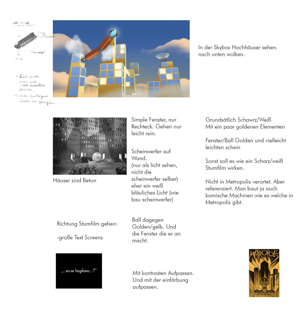
in order to get a clear vision for what our game shuld look like, I produced some mockups. These are some of the early ones based on 20th century art deco and russian propaganda art.
Interim
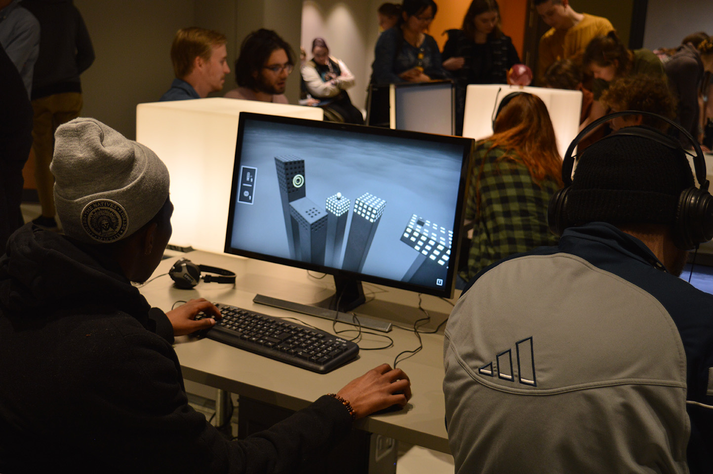
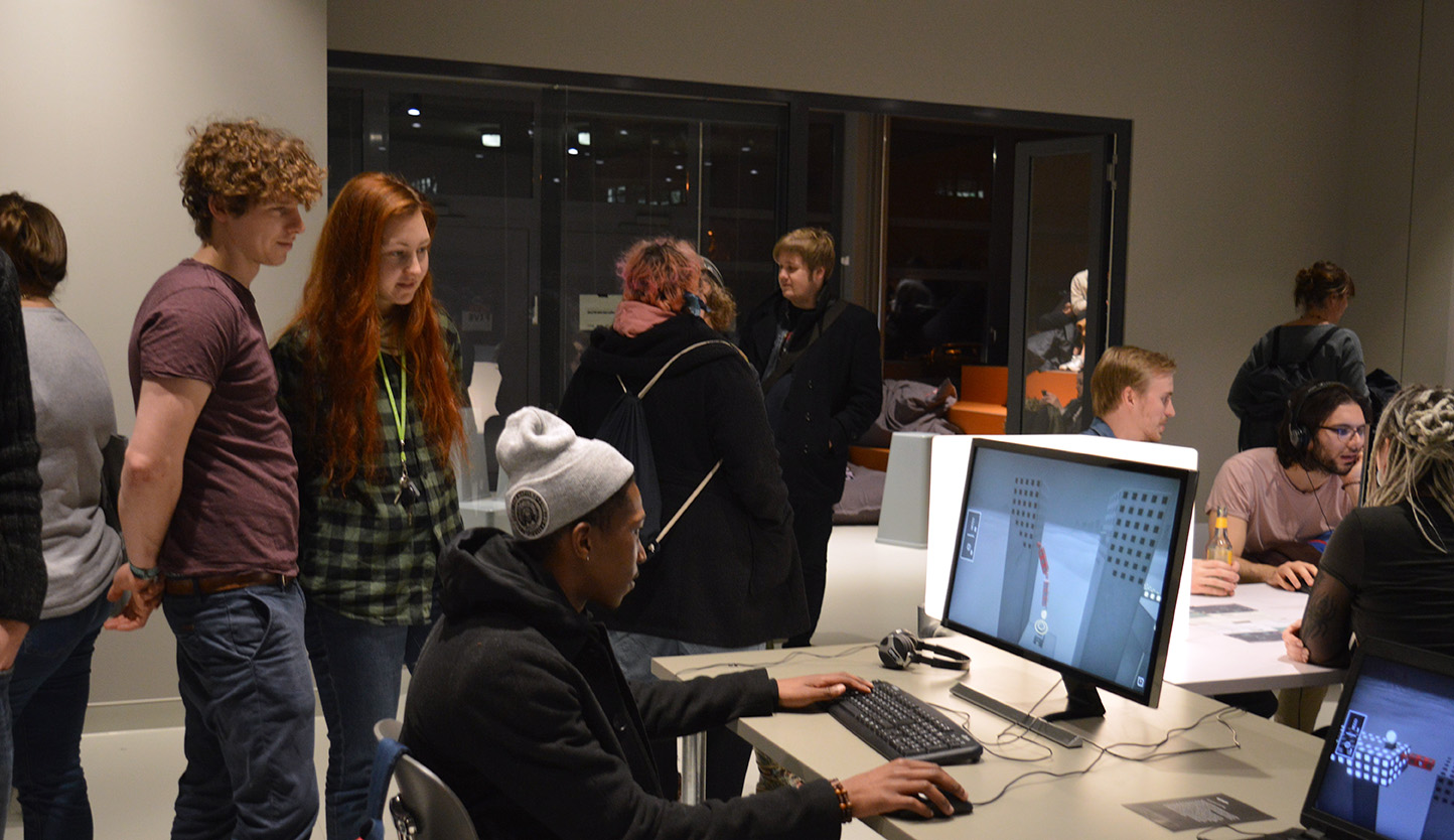
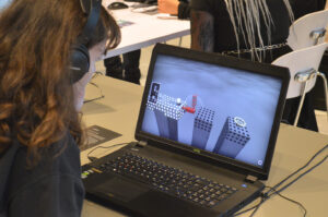
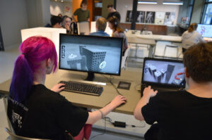
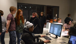
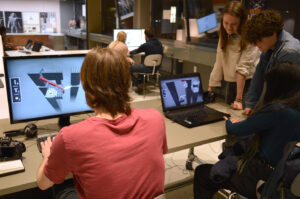
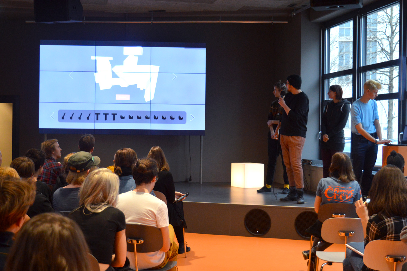
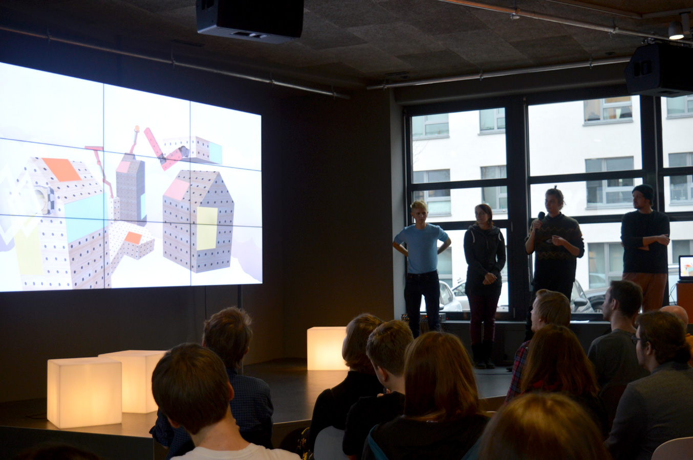
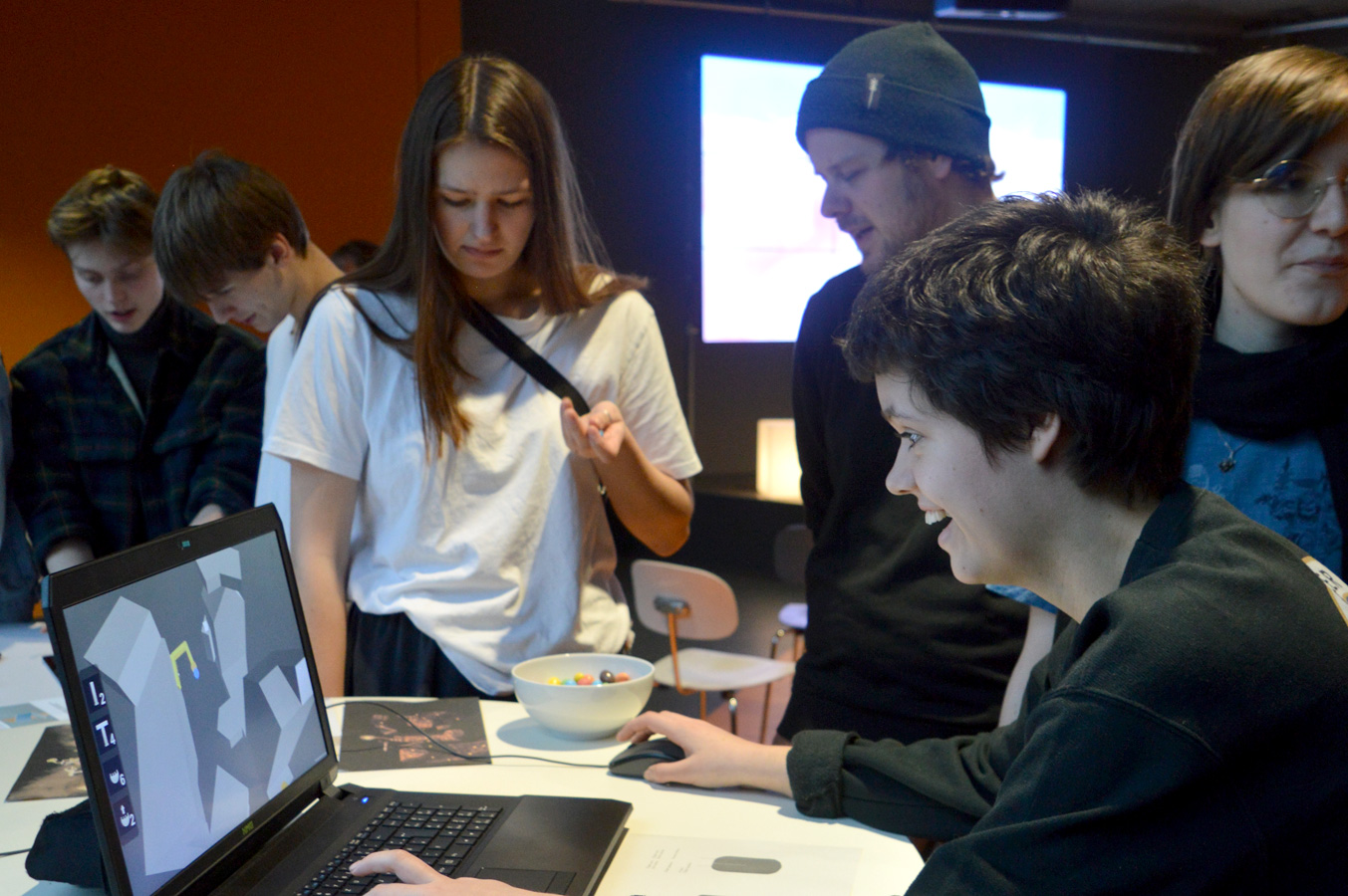
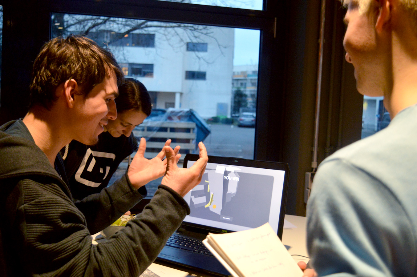
At our midterm presentation, we had the possibility to show what we’ve made so far and to have a public playtesting session.
We also presented our different fake screenshos with a grid-like playing field. Some of those triggered trypophobia (fear of holes) for some people. So we were extra careful from here.
Last iterations
We proceeded to use a cityscape with windows, as they would naturally lend themselves to a grid.
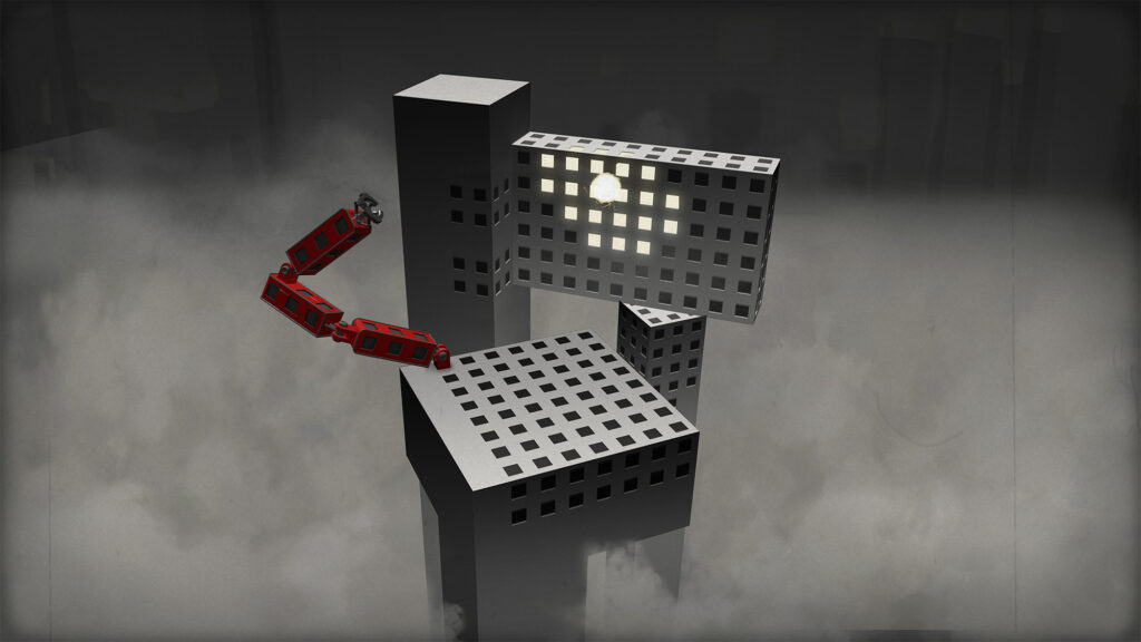
Heavily inspired by miniatures and props from the film Metropolis, I produced the final fake screenshot.
Final fake screenshot
Designing the Assets
Our movable assets needed to fit in the specific grid of the game and be buildable on each other in every possible way. So I needed to stick to certain guidelines for the shapes and sizes.
The design was also guided by a lot of playtesting. In the end, the most simple shapes proved the most useful, so players wouldn’t feel overwhelmed and could still build unique constructions. It also helped to keep the moveable objects withing the exact grid measurements. This allowed players to grasp the distances they needed their construction to reach.
How much Detail?
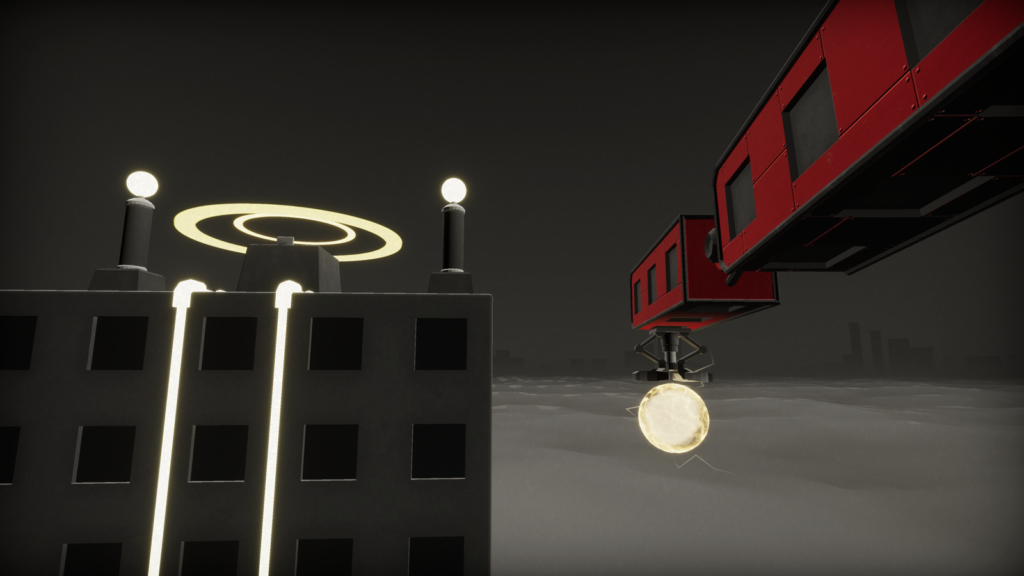
It took some iterations before we settled on this minimal amount of details. The construction objects should look like film props, yet give the feeling of being large and possibly made by humans. So I chose to give them a lot of small plates and screws that are mostly visible on a closer look but don’t disturb during gameplay. Players could also build a lot of these objects at once, so a low polycount was nice to have.
Shader
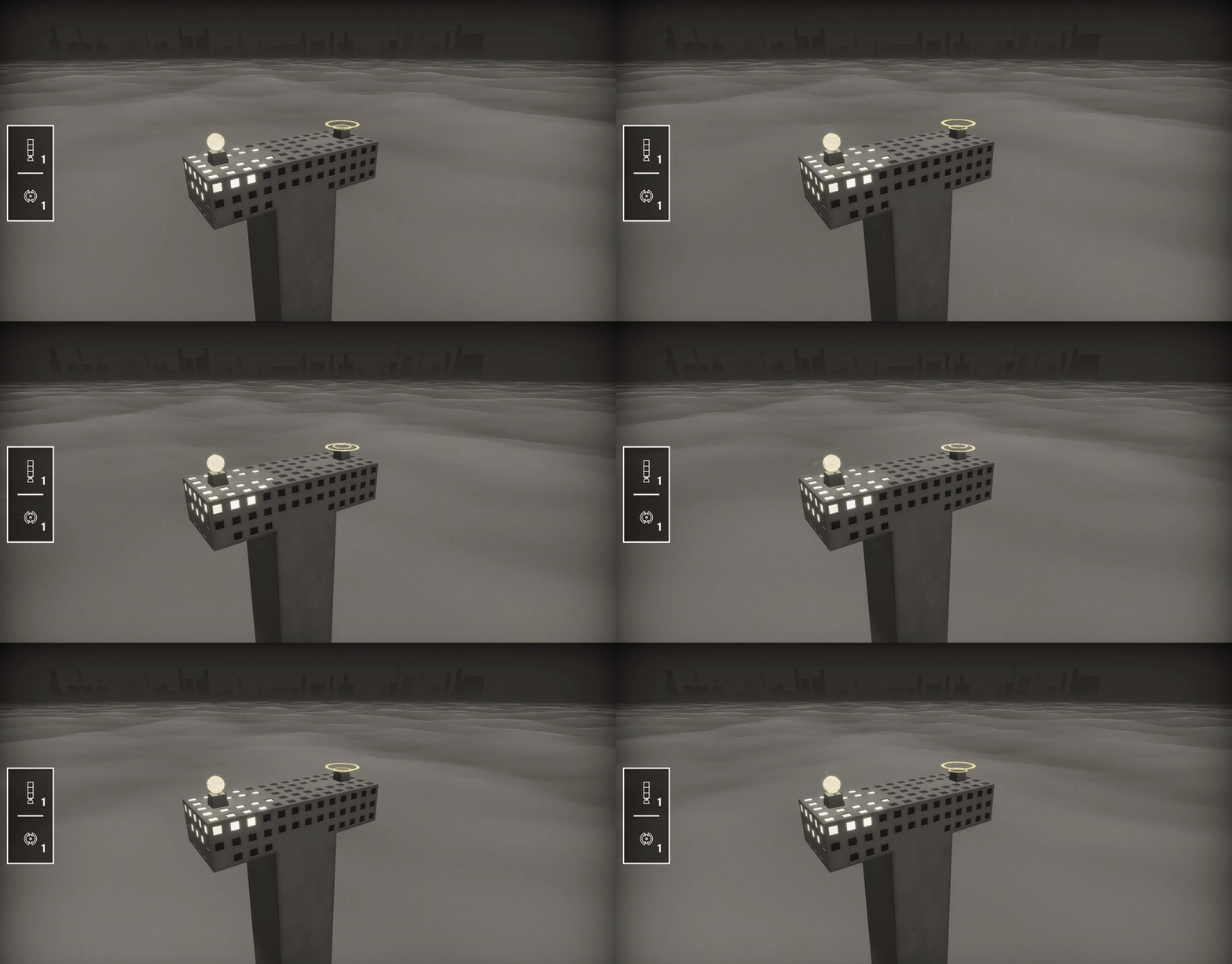
For the clouds I made a shader that covers the whole lower area and marks the end of the play field. It fades out the further it is from the middle to blend into the background. Buildings slowly fade into it, to give the clouds a feeling of density.
The main goal of the effect was to mask the lower end of the buildings in a nice way, so it uses a depth-fade for a smooth transition. Because we did a lot of quick iterations, the clouds consist of two procedural noises blended together. This allowed us to change sizes and type of noise quickly during production. To fade out the clouds in the distance, I used a simple spherical gradient texture as an extra opacity mask.
